 |
| Front cover of Splitting an Empire by Keli H (second book in the 400 series) |
By now, the world has seen the gorgeous emerald green and gold cover for my upcoming novel, Splitting an Empire. This is the second installment of the 400 series. It perfectly encapsulates the glamorous aesthetic of the story.
The cover design took us several weeks to pull off because there was a lot to consider. It wasn't simply a case of creating a pretty image. Here's how it all unfolded.
STEP 1: THE COVER DESIGN BRIEF
Splitting an Empire is the sequel to
The Four Hundred Club, part of the
400 series. This meant that the cover needed to form part of a larger, cohesive body of art and be marketable to readers who were already fans. My amazing editor, Isabelle Fouqereaux from The KREST House team based in Durban, oversaw the cover design process with the designer. Here's exactly what she handed to the cover designer in a cover brief:
- Read The Four Hundred Club to understand the style and aesthetic of the series as a whole. (The Four Hundred Club is like a prequel to the 400 Universe, where all the characters and overarching themes of the world are introduced.)
- The cover needs to capture the essence of the story backdrop: glamour, wealth, hedonistic luxury.
- Other stories with a similar essence include books like Gossip Girl, The Beautiful and Damned, Crazy Rich Asians; and TV shows like Dynasty, Bling Empire, and Real Housewives.
- The cover of Splitting an Empire needs to look similar to the cover of The Four Hundred Club, while still being distinguishable as its own story. This is to show relation between the books i.e they are part of the same series or universe.
- The cover needs to make use of an art deco pattern as this will be the art direction for all the future books in the series.
- The cover colour palette cannot be black and gold as this will look too similar to the first book, confusing readers and may not alert them that there is a new book to buy.
- The cover colour palette can be any of the following: white and gold, royal blue and silver, or emerald green and gold. Other colours are reserved for future books.
- The cover imagery, if any is used, cannot include recreations of people or specific scenes from the book. The aim is to capture the attention of readers of high brow contemporary fiction, who will recognize it as part of their favourite genre by the aesthetic of the cover.
- The book cover needs to contain the series title (400) as well as the individual book title. Use the Sweet Valley High series by Francine Pascal for understanding of a cohesive universe in covers. (I have also written a quick bit about how the
400 series by Keli H is going to mimic the Sweet Valley High universe. You can click on the highlighted words to go to the post.)
- The spine needs to contain the series title and individual book title to help readers recognize it as part of their favourite series.
The brief handed to a cover designer is ultimately a distillation of marketing techniques to increase sales, and art direction.
You'll notice that cover designers at my
South African publishing company, The KREST House, are not treated like service providers - they are the experts at what they do. We will never say to them specific things like, "Place the title in the top right hand corner" , or, "Use green in the shade hex code...", and, "Put a flower with five pink petals and exactly two leaves in the middle". This sort of direction completely undermines their skill and gives us no use of their expert knowledge. What we do is give them the goals and objectives of what we are trying to achieve (a coherent contemporary fiction series whose essence is of glitz and glamour), and they will find the best way to accomplish the objective.
STEP 2: THE COVER SAMPLES
The cover designer was Nathan Gous, part of the KREST team based in Cape Town, and he has worked on some of our publishing house's most amazing book covers. Nate, as I like to call him in long winded team check-ins, took some time to create 3 rough cover samples for Isabelle. The process at The KREST House is that there will be 3 rough drafts from the designer, based on the cover design brief. The editor and author will pick just 1 cover to refine further as the final. Side note - it was amazing to feel like I was having a real author experience handled by a professional publishing team, since I'm always on the publisher side of things! The team handled this flawlessly with no need for me to step in.
The three samples:
Concept 1 was the emerald green and gold option, with tones of black to deepen the background. This colour combination was stunning! The art deco pattern, I later learnt, is actually a custom illustration drawn by Nate specifically for this book. The gold stripes at the top and bottom tie in perfectly with the first book (the same stripes appear on the cover of The Four Hundred Club.) Like the first book, it is an elegant backdrop with the title and author name as the focus - perfectly tying in with the larger series. The icon of the ring, split clean in half, alludes to the storyline of the book without trying to override the reader's imagination. They are very much left with an essence of glitz, glamour, opulence and a small nod to the story through the ring, rather than a tell all type of cover.
The story of Splitting an Empire by Keli H is a return of the original Four Hundred Club characters. It is now 4 years after the friends met on the series of the glamorous reality TV set, and their lives are settled and perfect. Until Kiara learns a terrible truth about the wealthy, influential family she is married into. Will she and her friends be able to go up against one of the most powerful families in the city, in her quest to reclaim her life?
This sample being a rough draft, it was still very visually overwhelming; text-heavy, too, with a tagline, series title, book title, and author name. And the gold stripes threw off the spacing on the back. This was the publishing team's favourite cover. But if this was the selected cover, it would need some further adjusting for perfection.
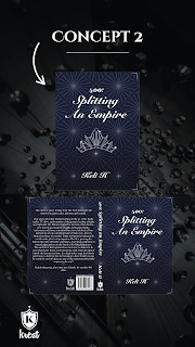
Concept 2 was the more minimalist, refined version of royal blue and silver, with white text to stand out. This sample cover is very pleasant on the eye. All the colours work in harmony. The text is very legible everywhere. The spacing is very liberal and breathable.
However, the energy of the cover is incredibly different from the first sample. Where sample 1 is opulent and lavish, sample 2 is elegant and refined. It shows luxury in a gentle way, not in the very extravagant way that is the essence of the 400 series - remember, this is a series against the backdrop of the world of reality TV. The crown also seems too literal an interpretation of the word 'empire', when the book actually explores family and business alliances. Ultimately the essence of the book was not captured.
Interestingly enough, there was a voter poll run on all the cover samples, and this cover concept was the most voted for. The voting was done by nearly 100 general readers. It was, however, the publishing team's least favourite sample.
Concept 3 tried the white and gold combination. The combination itself speaks to high luxury. The white and gold is also actually perfect for the storyline of Splitting an Empire - this is a story about a glamorous marriage gone wrong. The ring symbolism against the white captures the story essence perfectly. That art deco pattern - also a custom illustration by Nate - is incredibly on brand for the 400 series.
The only thing that doesn't work about this concept is the way the gold text clashes with the gold tones in the background. The text isn't clearly legible because of this fight for the eye's attention.
This was the publishing team's second favourite cover. This was the least favourite cover concept in the voter poll. If we chose this, it would certainly need some tweaking on the visual clarity, but this was the concept with the greatest potential of the 3 samples.
SELECTION AND REFINEMENT
By this stage we had 3 cover directions and lots of opinions on all of them. To steer the process with control, we needed to interpret all the thoughts and pick just 1 cover direction to go in.
The publishing team made a difficult decision. Even though concept 2 had received the most votes on the general reader poll, it was not the most suitable cover because it did not fulfill the cover brief, which was obviously not shared with the audience. The audience was voting on visuals alone, and concept 2 was the most neat and pretty of those visuals. From the standpoint of the parameters needed to market and sell the book, concept 2 did not achieve what the cover brief had asked for.
The publishing team and I chose concept 1 to work with because it filled all the cover brief criteria. Then came the job of making some tweaks to create the final design.
One reader who participated in the poll suggested we remove all the gold stripes to lighten the clutteredness. We gave it a go and this is what that looked like.

It definitely eased the cover, but ultimately left it looking too 'unfinished'. Like there was something missing to tie it all together. (I know the blurb is missing but keep in mind that the reader is not seeing the whole flat lay spread like this. They are only seeing either the front half or the back half at a time when they hold a printed book. So we're focusing on the front.) The plainness of the cover now actually detracted from the beauty of the art deco pattern, rather than showcased it. So we decided to put the gold stripes back in. Plus the stripes were still a nice nod to the first cover. What we did decide to change was the story tagline in the top gold stripe. By removing the tagline, it made the cover far less text-heavy. We then put the series title (400) in the gold stripe instead. I was a little glad to do this because I couldn't imagine thinking of different taglines for all the future books in the series if I started the trend now.
And this is the final finished cover! I am a happy author. My biggest love to Isabelle and Nate. Hopefully the next time I write about this book it will be with some solid release plans.
For more articles written by Keli H, the author, visit this blog's home page on keli-h.com
Keli H is the award winning author of the 400 series, which includes The Four Hundred Club and Splitting an Empire. The 400 series is high brow contemporary fiction revolving around the lives of wealthy circles. Keli's other works include Creating Literary Art. She is also the founder of The KREST House, a storytelling empire.


Comments
Post a Comment